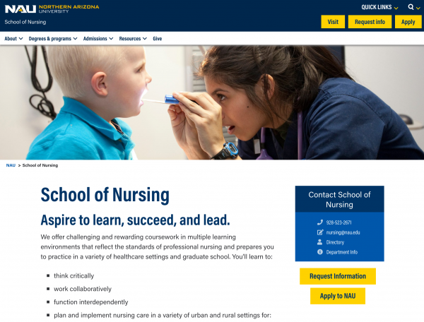
The Nursing website project was smaller in size but represented the first user experience collaboration between the Experience Design Team and University Marketing.
Representatives from Marketing came to us asking for help in reorganizing the School of Nursing website. After determining that the current state of the website was confusing to site visitors and the Nursing administration staff was overwhelmed with inquiries, we immediately set up a testing session to get student feedback on the existing site.
Testing identified 6 primary pain points. We developed solutions that were compiled in a report submitted to both Marketing and Nursing for their review.
- Primary navigation was ambiguous and caused confusion. Solution: New IA will remove the navigation loop. Improved navigation will allow prospects to browse degrees based on academic level or desired location.
- There were insufficient inline links to assist with the users journey. Solution: All pages now have relevant sidebar content with links. More inline links were added to all body content.
- The “Apply Now” button created navigation loop. Users did not know what to expect when this button was used. Solution: Total rework of the application pages with more direct links.
- No call-outs directed specifically to transfer students. Solution: Undergraduate admission page now has an inline link for transfer students.
- Local search results were not producing expected results. Solution: IA has been improved to direct users away from search. Page names have been optimized to improve search results.
- Some links in site directed to old Ektron pages. Solution: Redirects were requested for all non WordPress pages.
