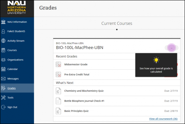
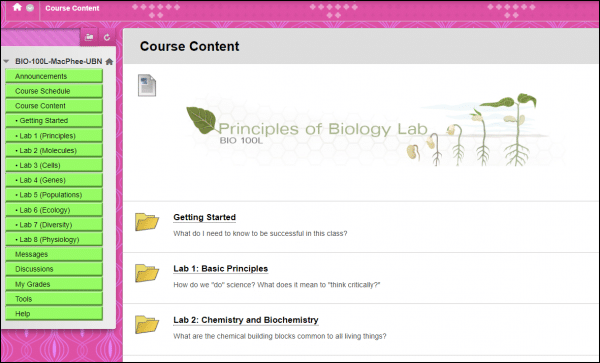
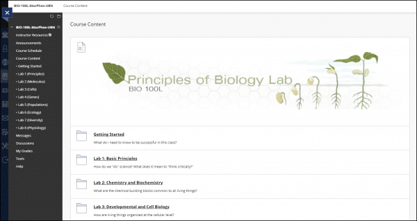
Bb Learn has a new look! Faculty and students will enjoy an improved teaching and learning experience in the new Bb Learn.
You’ll find the same functionality, and now it’s easier to do your classwork on any device, any time, anywhere.
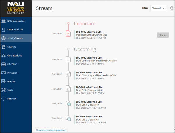
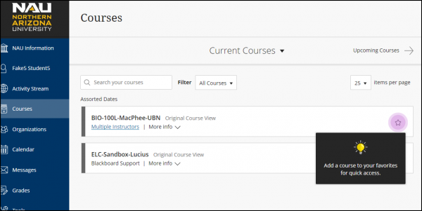
Blackboard’s new look primarily affects the entry page to the system. It contains the “Courses” view you’re accustomed to, but now sorts courses into past, current (the default), and future. There’s a new “favorites” option that lets you move courses you’re using a lot to the top of the page. In addition to the courses view, there’s a new view called “Activity Stream” which is a time-based way to display notifications in all of your courses.
Once you enter a course, the left side menu color is now standardized in high contrast colors, and the icons have been updated, but course tools work just as before. These changes were applied during summer and were done to increase consistency across courses, to improve accessibility for disabled users, and to make the interface work better on mobile devices.
What is Bb Learn’s New Look?
A fixed menu places the most important tools and activity front and center — students and instructors may quickly and easily see the information they need without having to dig into each course.
- The new look replaces the “My Bb Learn” entry page
- Fixed menu of tools is always available
- More responsive for mobile devices
- More accessible for ADA compliance
- Holistic rather than course-centric view
- More modern look and feel
- Greater consistency in course colors and fonts
The Activity Stream displays the most vital information in one place – what is due, what is new, what needs attention. Jump directly into the associated course activity right from the list!

The Course List is more intuitive, showing your current courses by default. Add a course to your Favorites list, so it appears at the top. Filter your list to see what you only need to see.
Learn more about the menu items at Blackboard’s Ultra Base Navigation site.
Why Are We Changing?
- The “My Bb Learn” page has changed very little since 2011
- The new look is responsive – it works better with mobile devices
- The new look is more accessible (ADA compliant)
- Students are asking for more modern, easier-to-use tools, and a more consistent interface between courses
- The new look only changes navigation outside of courses and course themes – course structure and functionality will not change
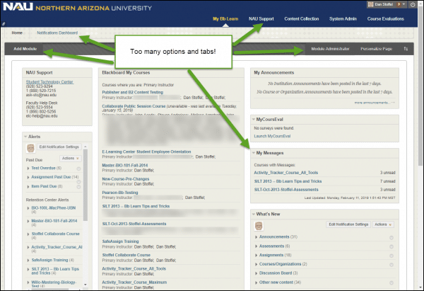
The old “My Bb Learn” page has a multitude of modules and so many different tabs and options that it has become cluttered and confusing.
Modules are too customizable, so they may or may not be present depending on the preferences of each user, and may not be in the same location even when they are present.
The new look will also apply a consistent theme (colors and styles) to all courses. A frequent complaint from students is that text can be difficult to read because of poor contrast and color choices. The newer theme should help with those issues.
What Does This Mean for Me?
Students Accordion Open
You shouldn’t need to do anything; on Friday, May 17 you will notice that Bb Learn has been updated to Ultra Base Nav. If you have trouble finding your courses, configuring your Activity Stream, or anything else, please refer to Blackboard’s Ultra Base Navigation Info for Students or contact the Student Technology Center:
Ask-STC@nau.edu
928-523-9294 or toll-free: 888-520-7215
Faculty Accordion Closed
As you update your Bb Learn courses for upcoming semesters, check for references to the “My Bb Learn” page and update them accordingly. If you would like to see a preview of how your current courses will look with the new theme, or if you have trouble finding your courses, configuring your Activity Stream, or anything else, please refer to Blackboard’s Ultra Base Navigation help or contact LMS Faculty Support:
LMS-Faculty-Help@nau.edu
928-523-5554 or toll-free: 866-802-5256
